Role: Art Direction, design, illustration
Challenge: Develop a scalable design system to elevate the Marble brand, allows for effortless SKU expansion,
and creates impactful shelf presence.
Strategy: Develop a modular design framework built around solid typographic foundations, illustrations, and color hierarchy - allowing flexibility for new SKUs without the loss of brand recognition and local tie to Albuquerque.
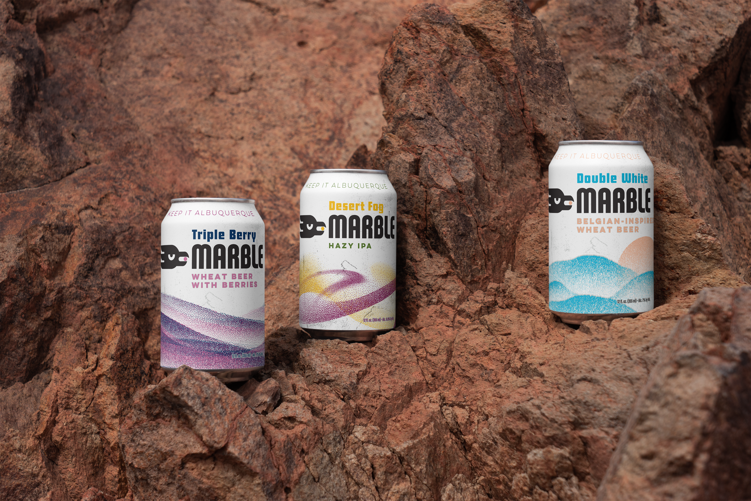
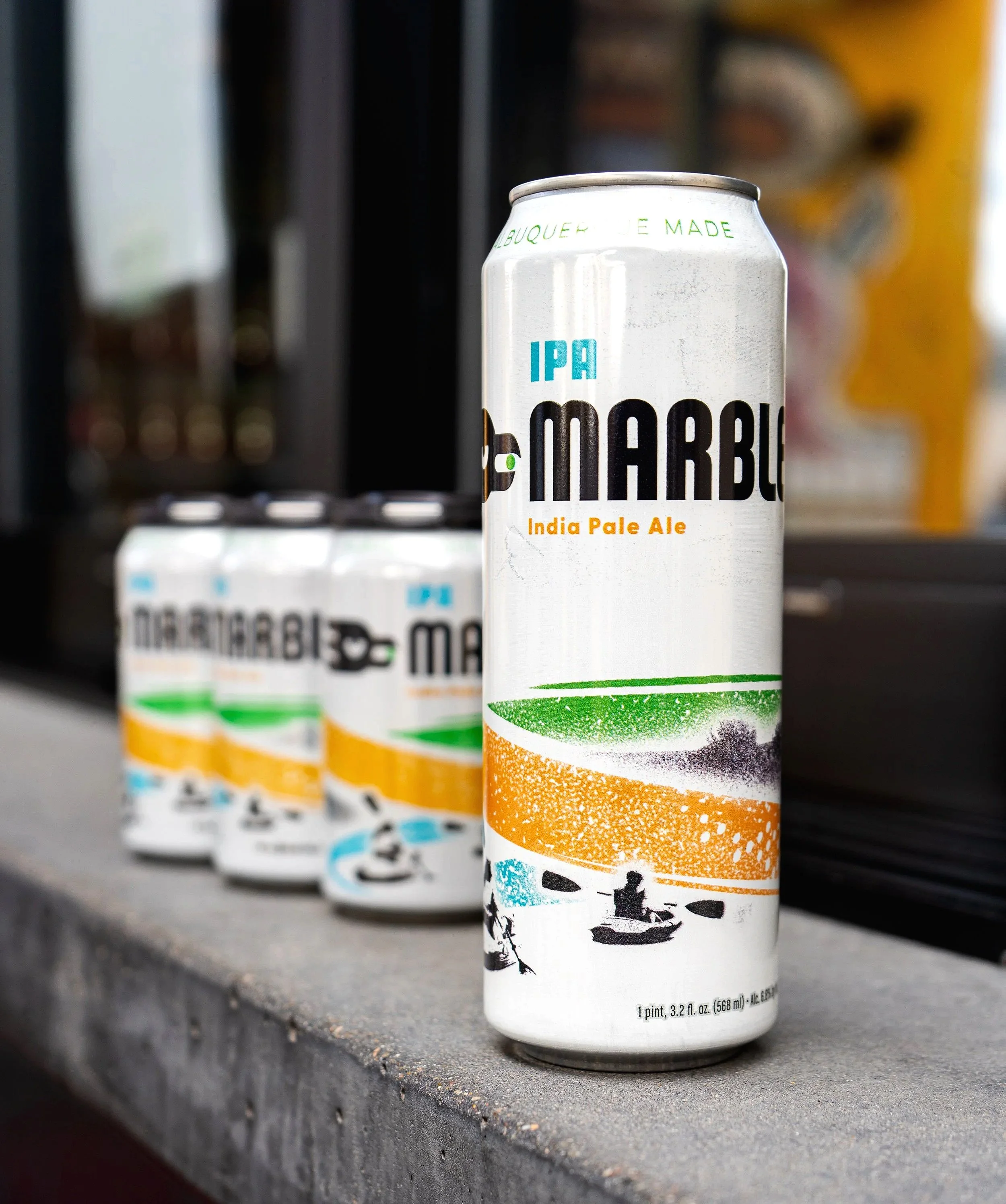
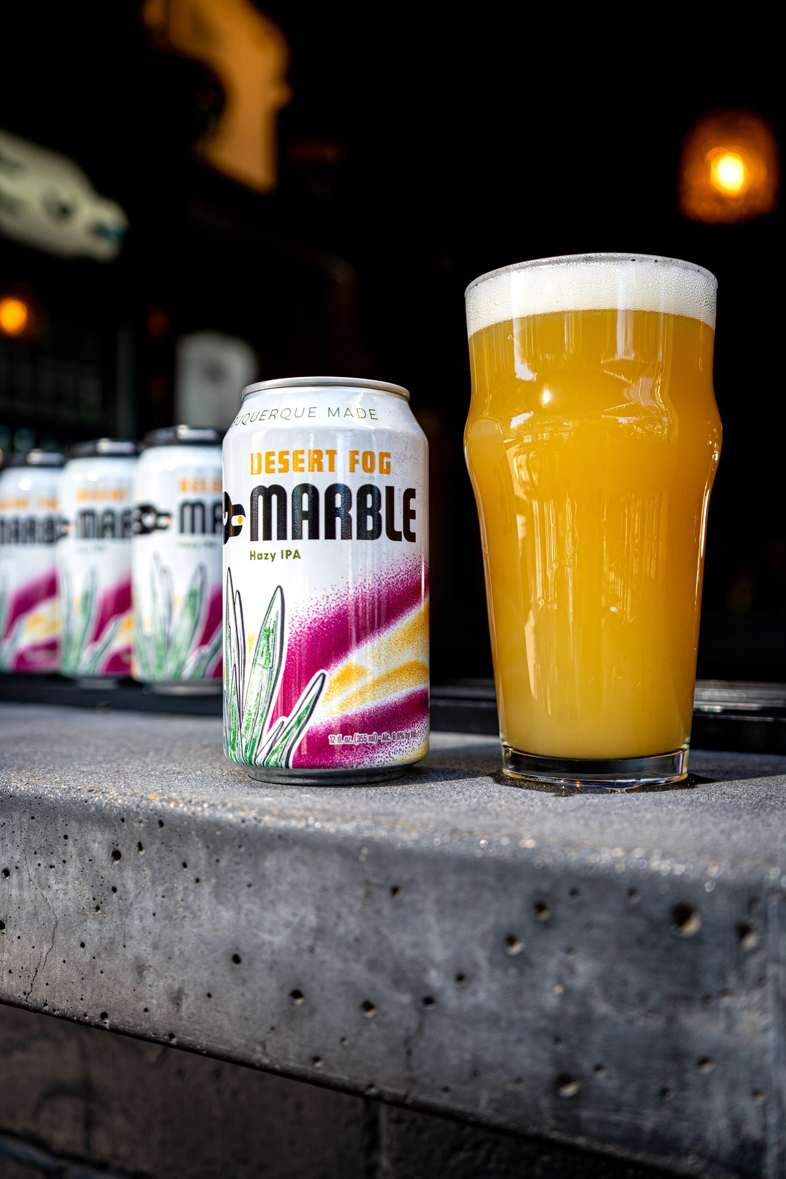
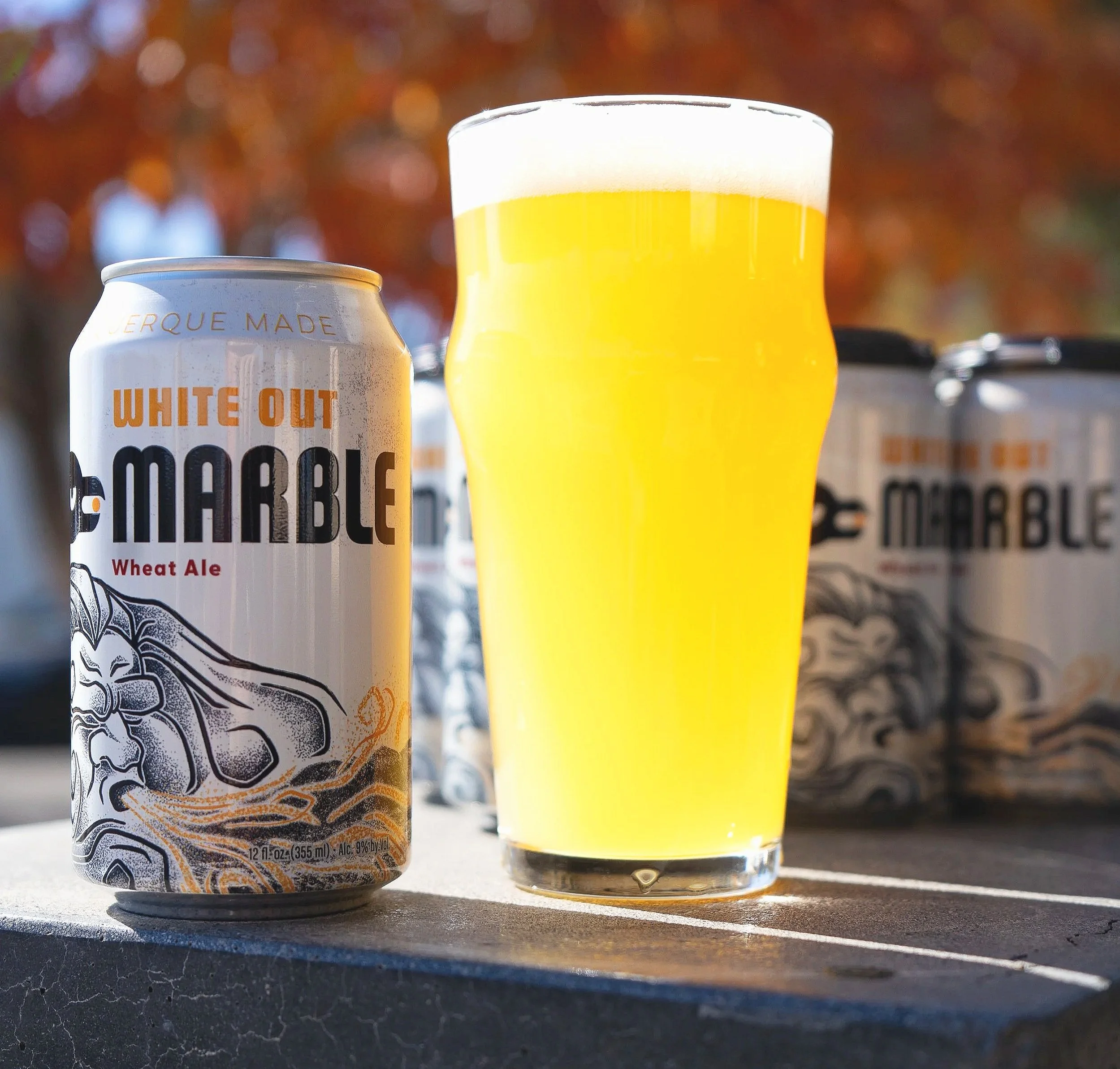
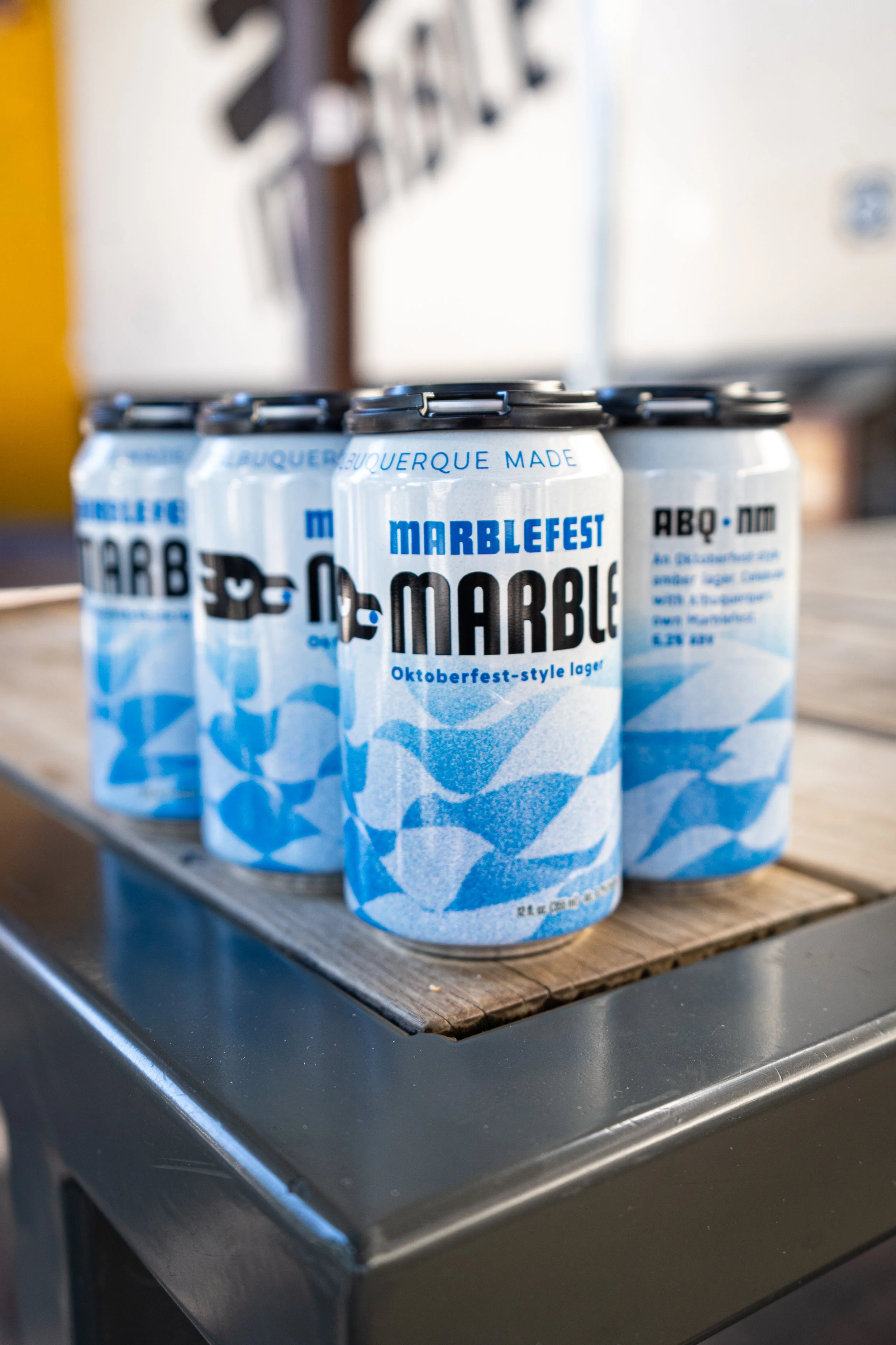
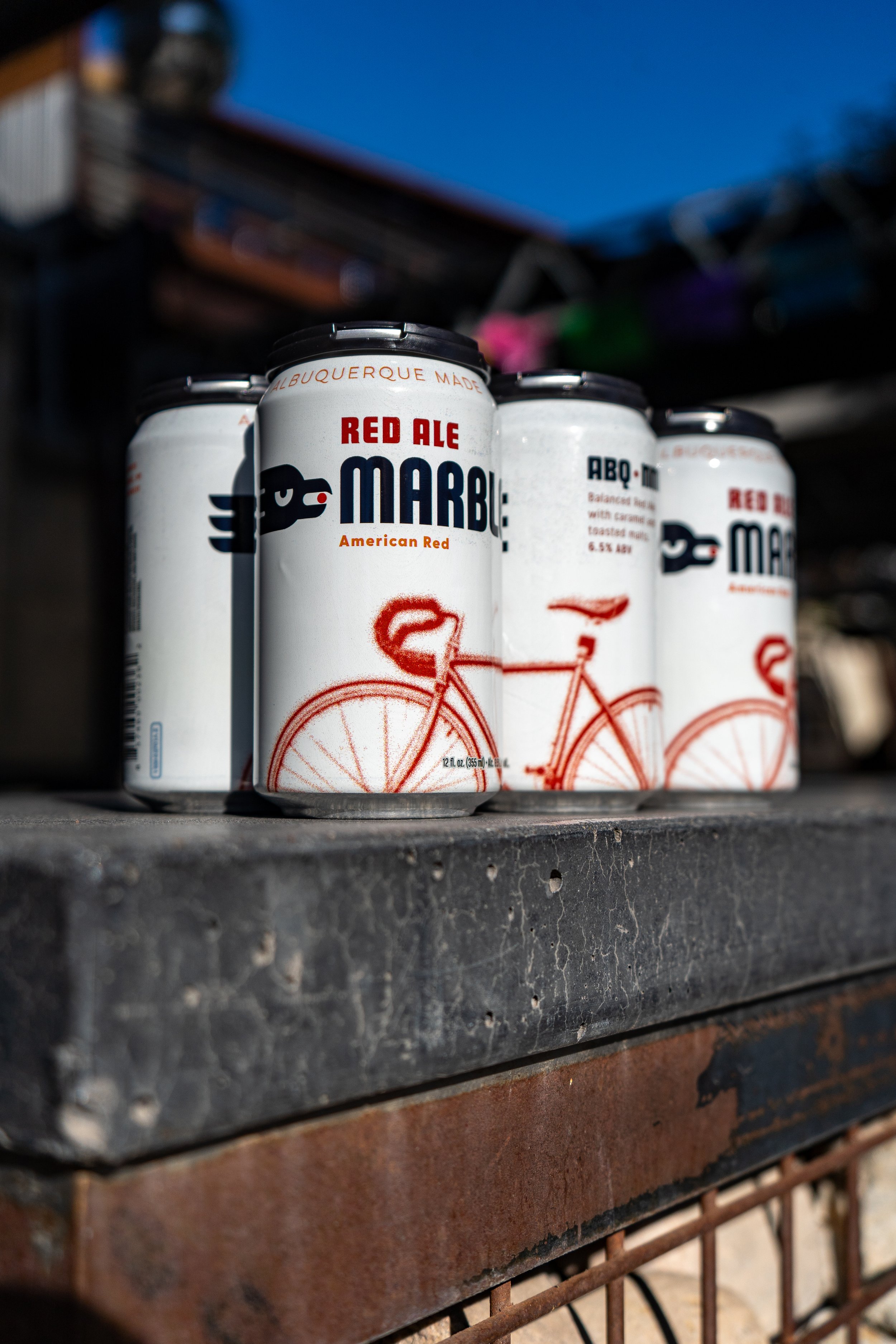
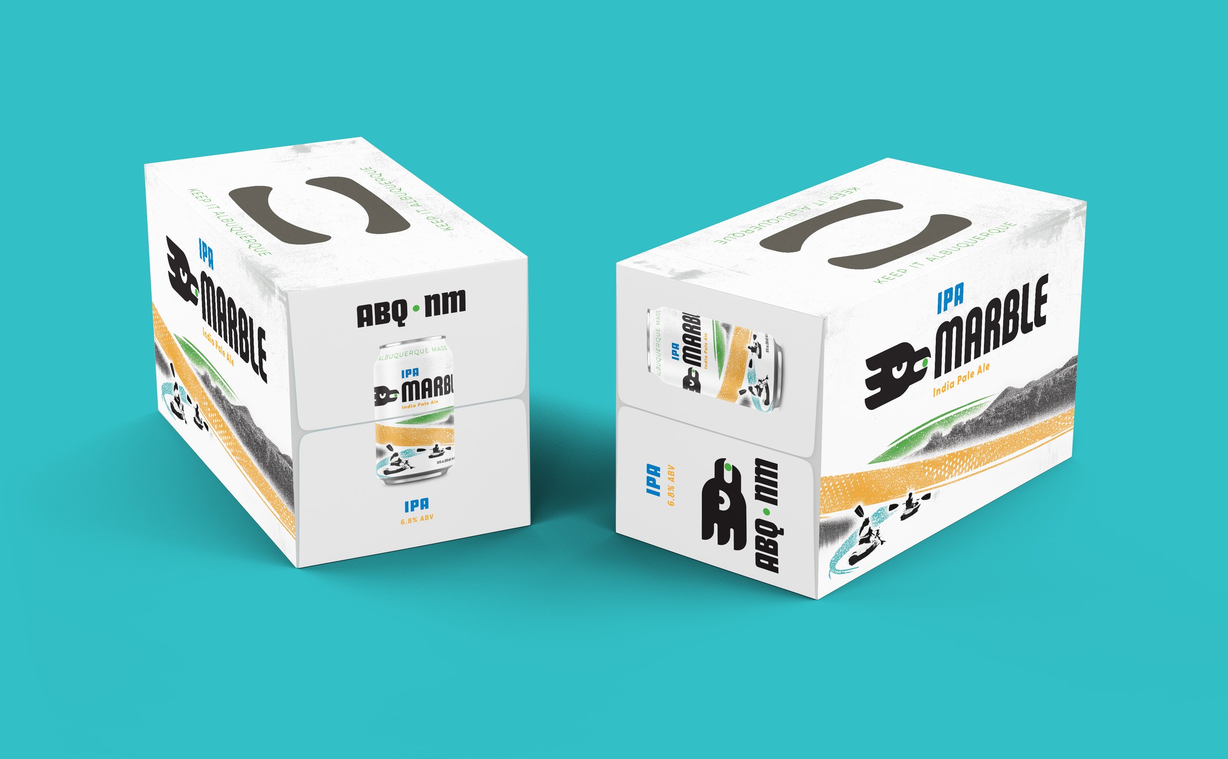
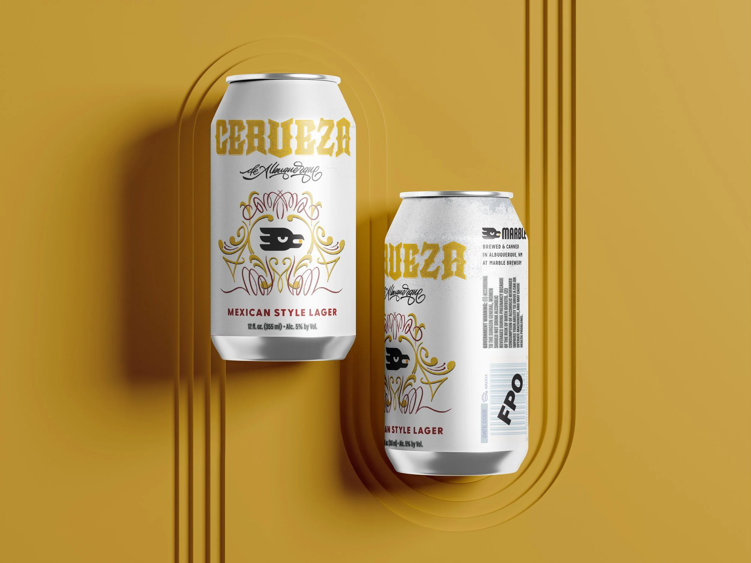
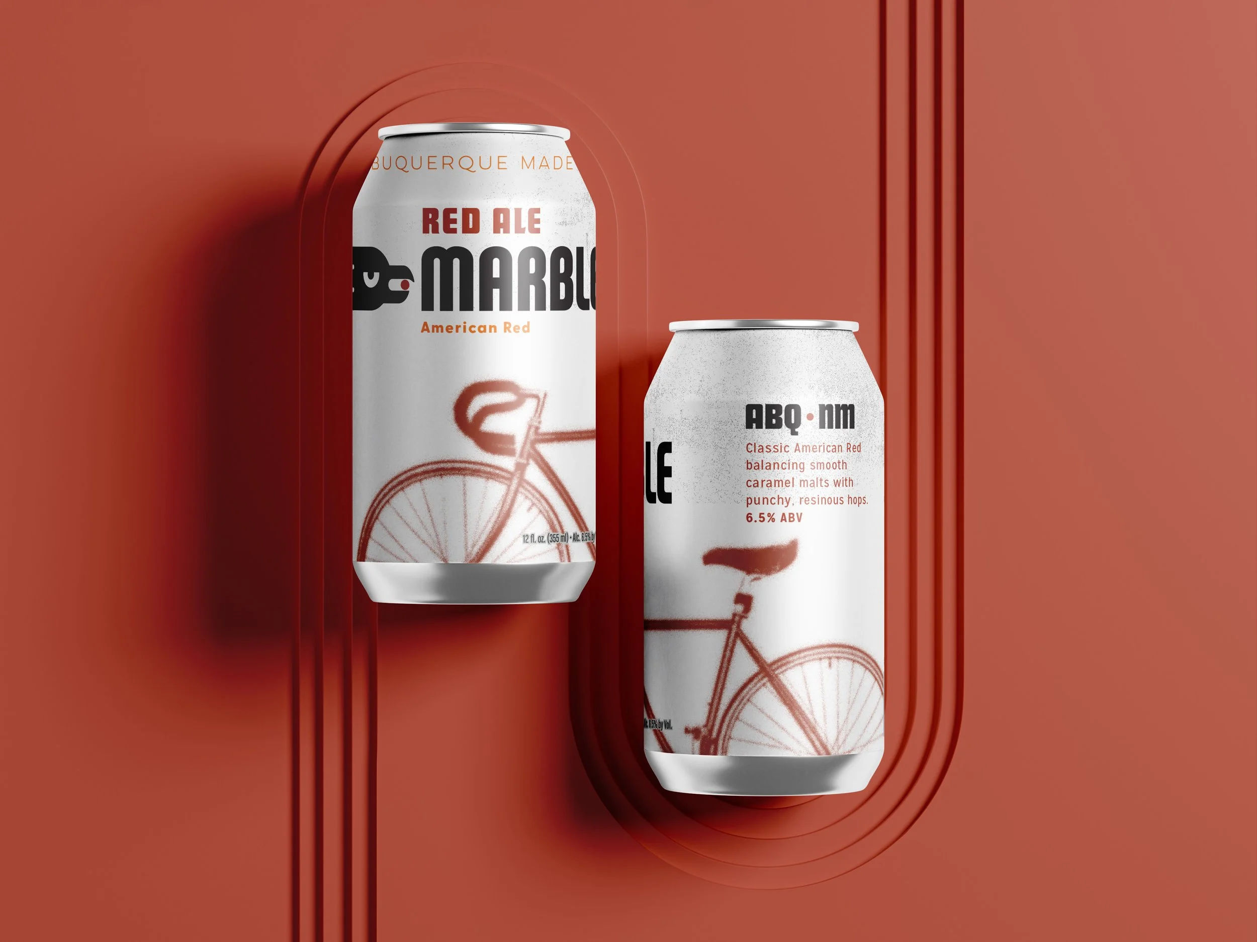
Solution: I developed scalable design system that introduced a unified grid, bold typographic structure, anchored by a signature illustration style. Each SKU features its own hero artwork, while maintaining alignment through consistent hierarchy, color blocking, and typography. The new system streamlines production templates, improves visibility on shelf, and establishes a visual cohesion across packaging, tap handles, and other marketing materials.
Impact: The new packaging system increased visual consistency across 8 existing SKUs, and easily expanded to a few new and seasonal products. The refresh launched in-line with seasonal releases and helped elevate Marble’s retail shelf presence, reinforcing the brand’s reputation as one of New Mexico’s leading craft breweries.
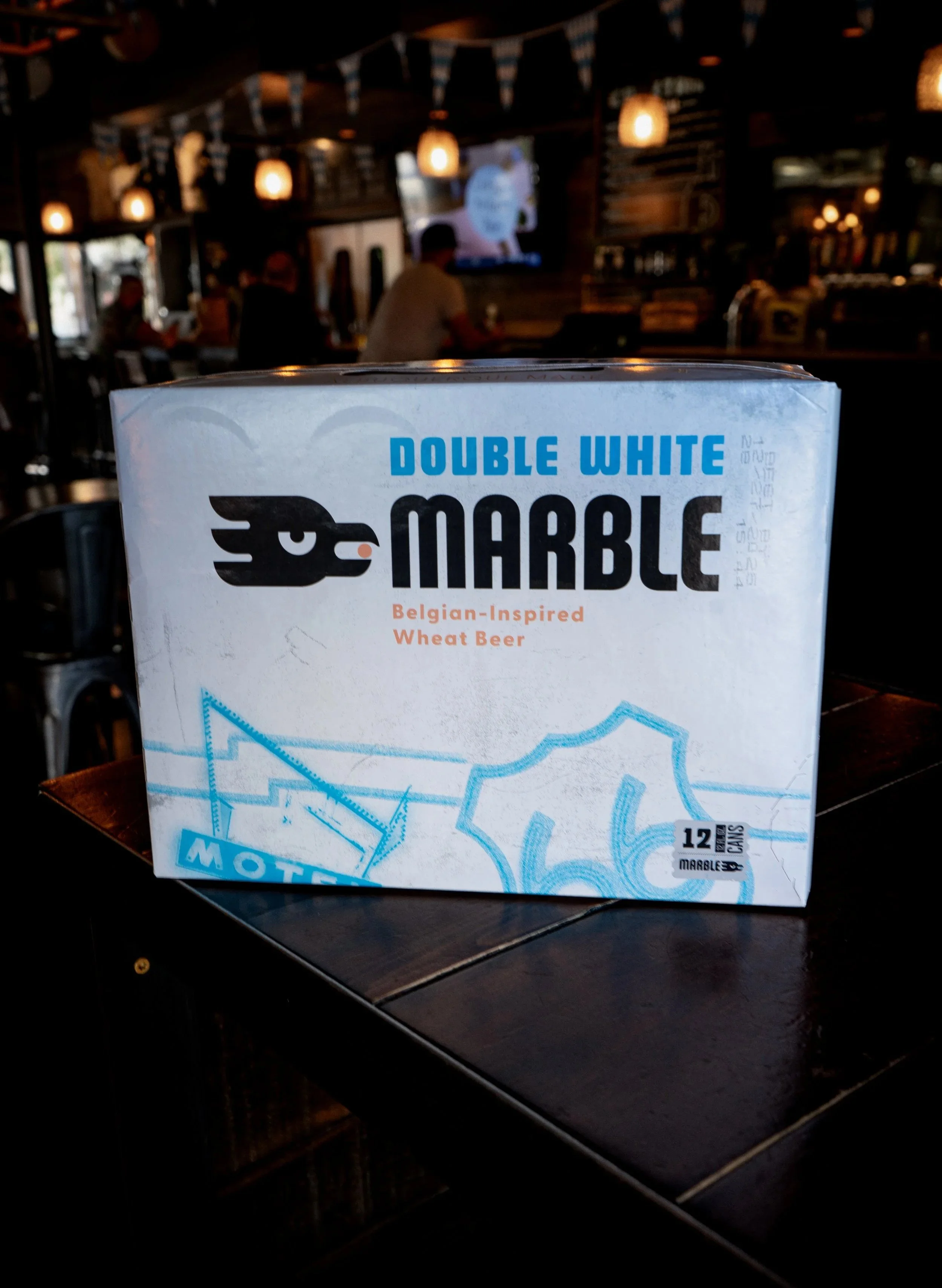
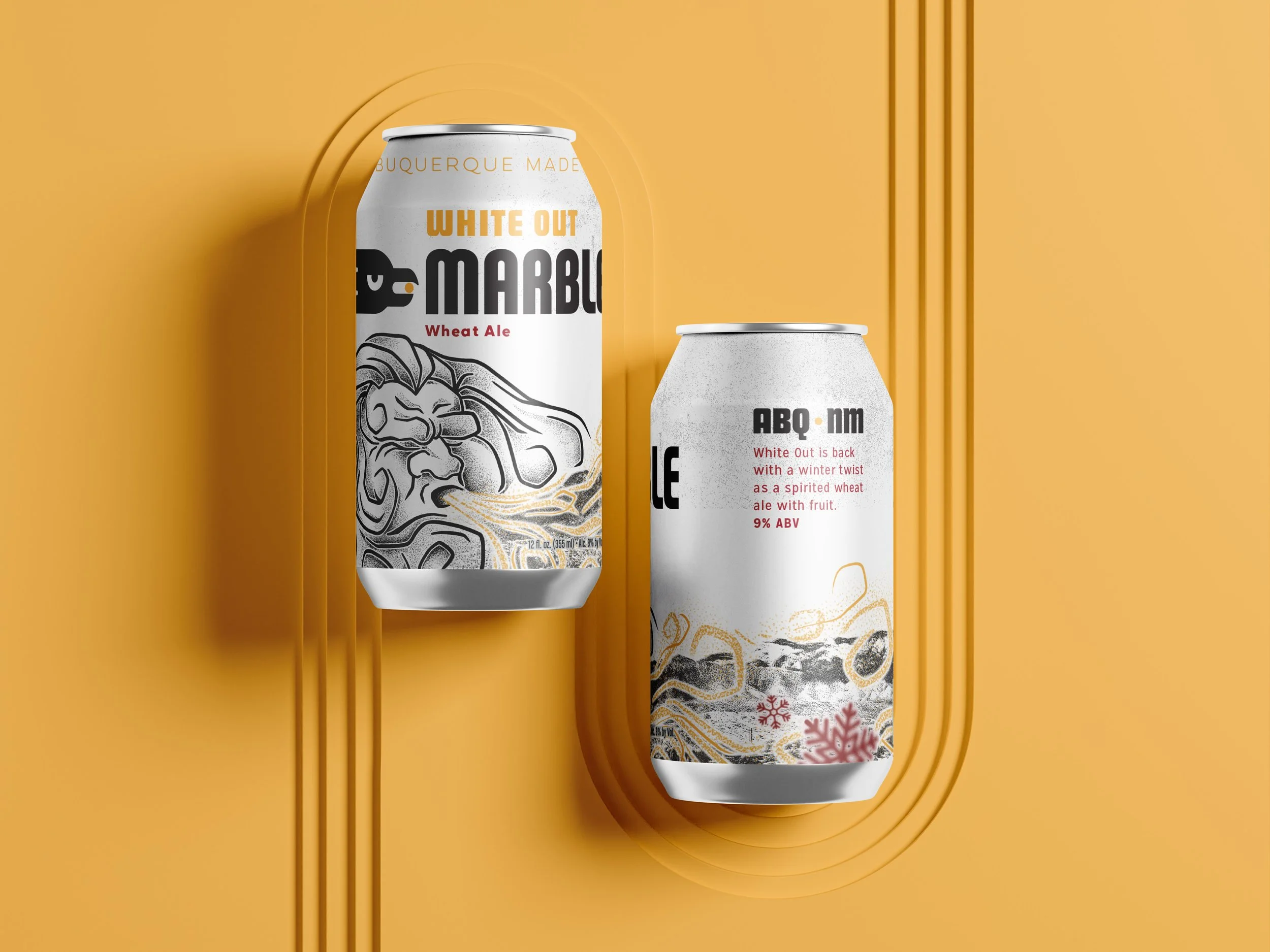
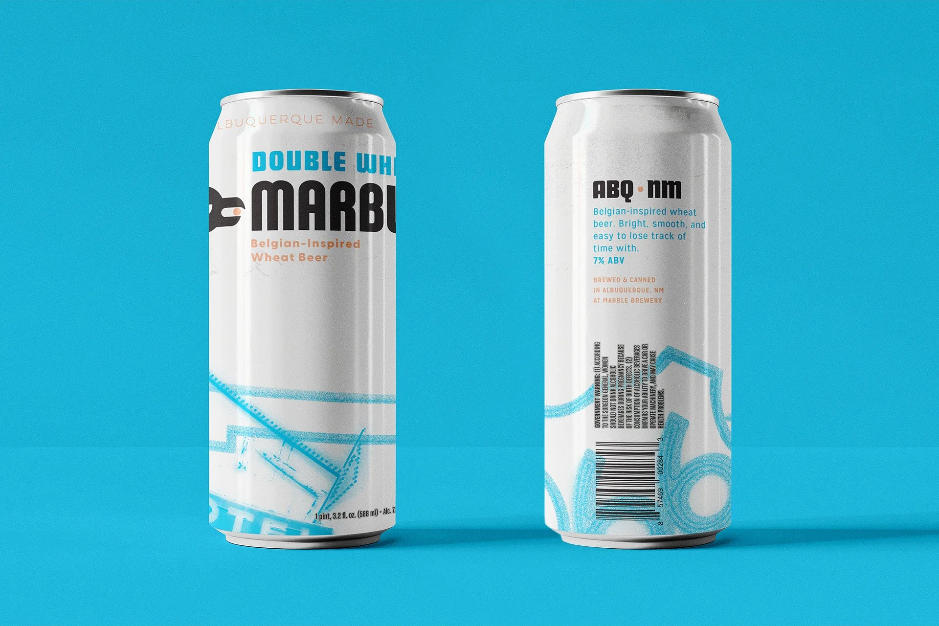
Marble’s Double White was in a steady decline of sales for the past 5-6 years. In November of 2025, sales leveled out for the first time. With the updated packaging design and revised recipe, the updates resulted in a
14% increase in sales.
Marble Brewery
Brand and Packaging Refresh
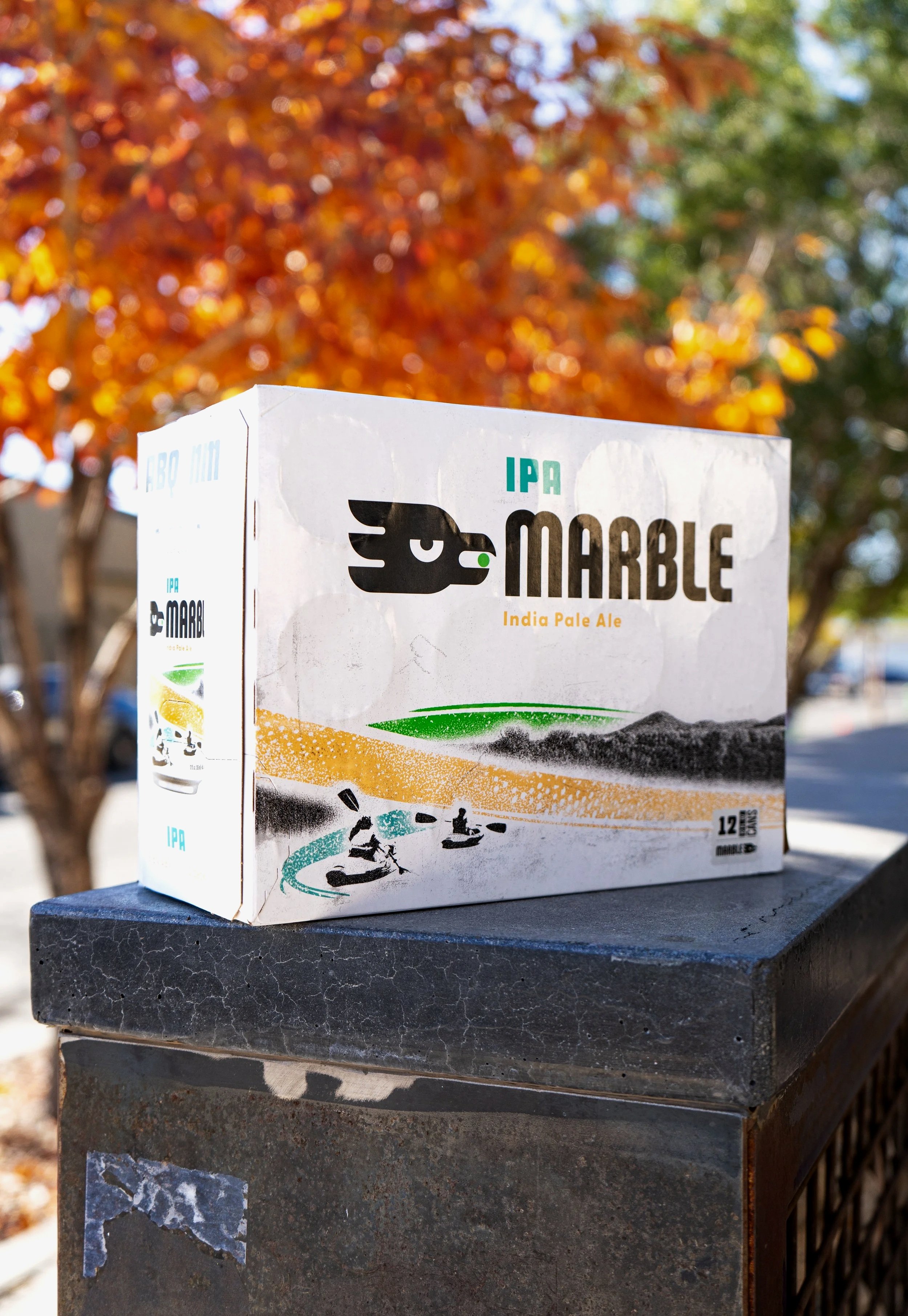

Product Renders


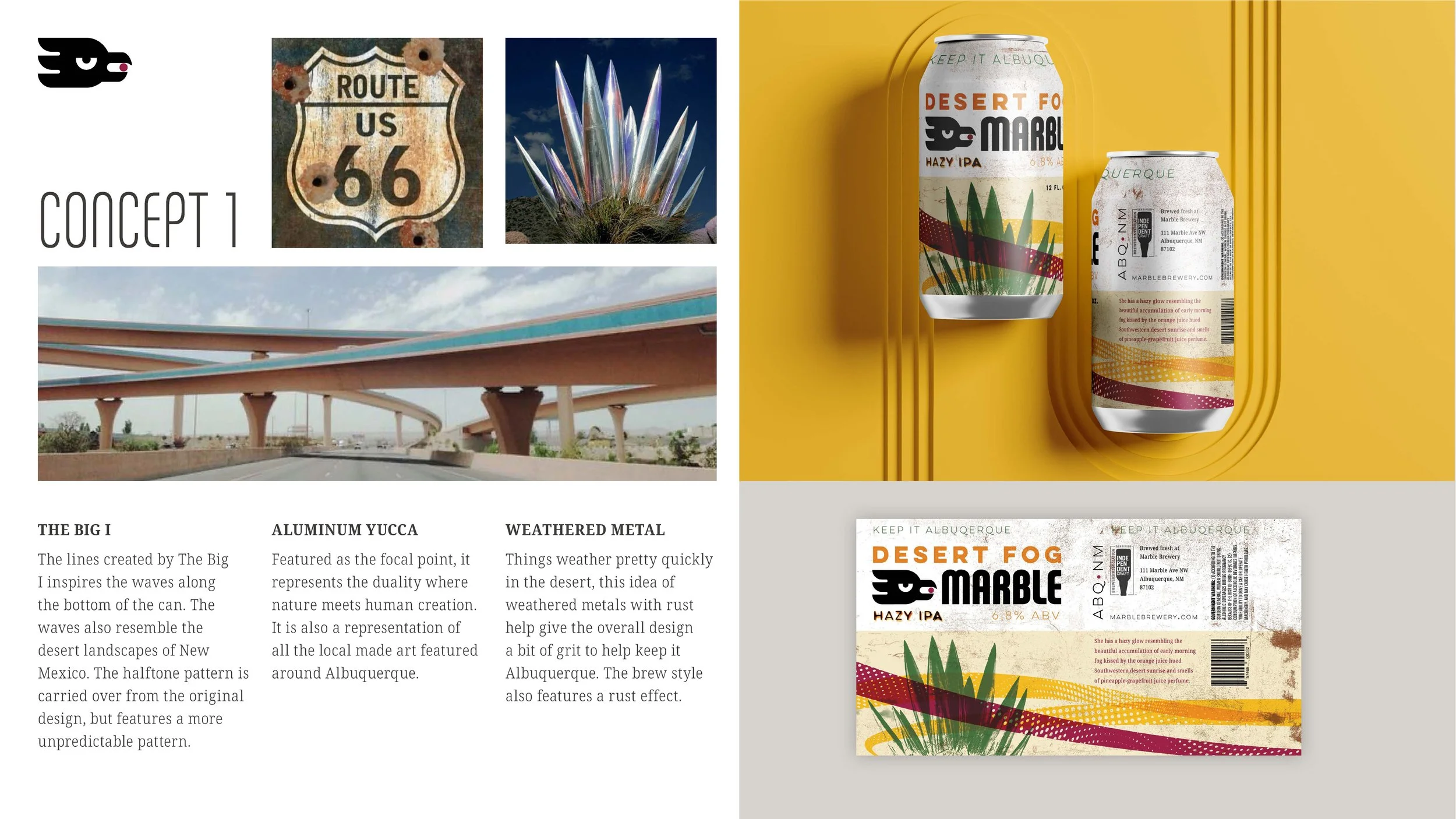
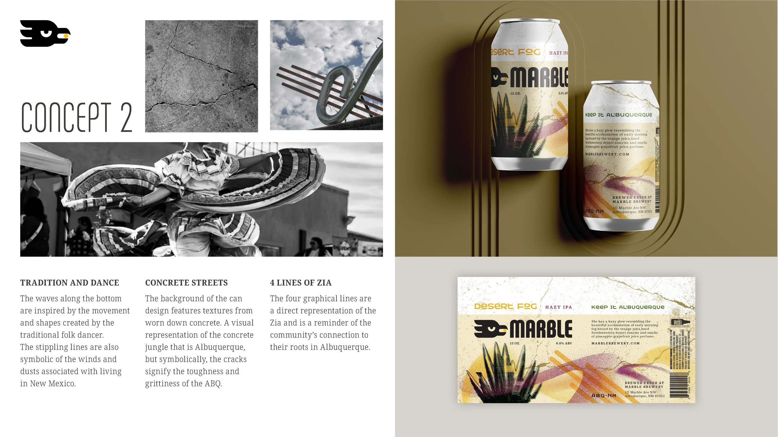
Early stage concepts