Role: Art Direction, design, hand-lettering.
Challenge: Design a new look for Cerveza to signify the new era and strengthen the brand’s loyalty to Albuquerque.
Strategy: Study strong cultural characteristics of Albuquerque that pay homage to its history.
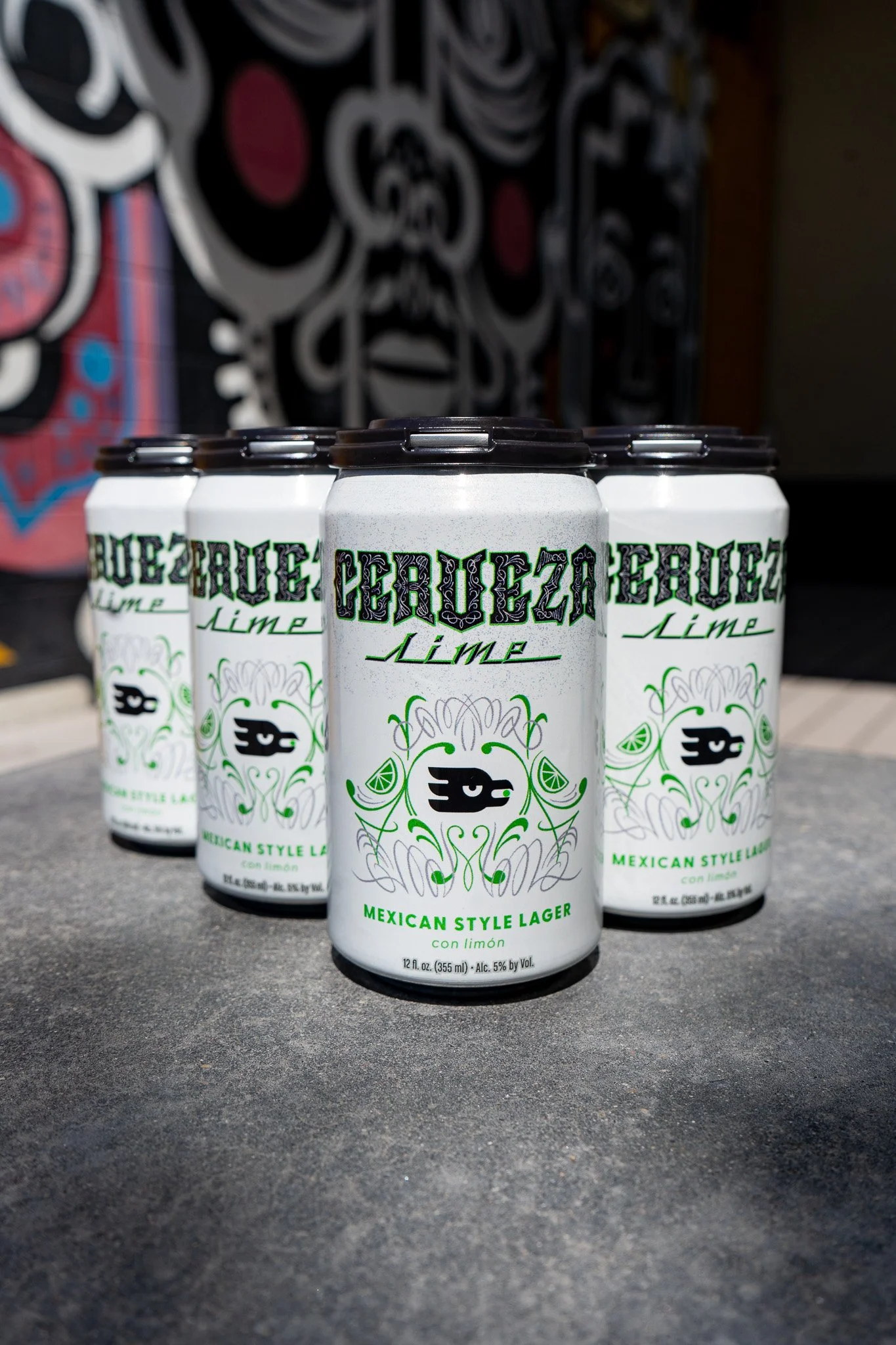
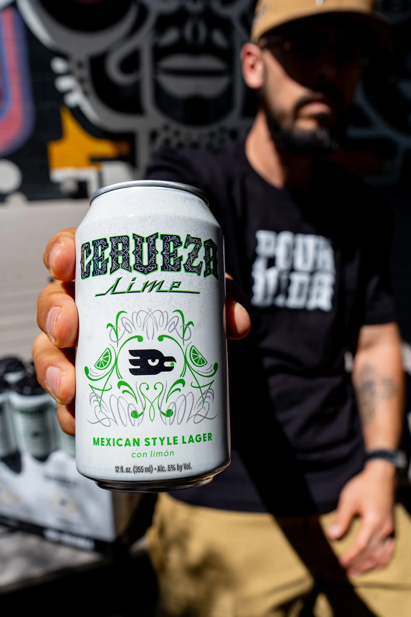
Solution: The lettering style of “Cerveza” is inspired by classic Southwestern signage. The ornate linework and embellishments were inspired by the pinstriping work seen on lowriders.
Impact: The relaunch of one of Marble’s most popular brews kicks off 2026 and offers consumers a new, elevated look, paired with a revised and improved recipe to enjoy in the coming Summer.
Cerveza was also expanded to another version, Cerveza with Lime, and artwork was modified to reflect the new flavor and retain existing brand presence of their best selling brew.
Cerveza
Brand and Packaging update



Product Renders


Early stage concepts


